

Noel Rappin has a Ph.D. in computer science from the Georgia Institute of Technology, where his research included methods for teaching Object-Oriented Programming and Design.
Meer over Noel RappinModern CSS with Tailwind
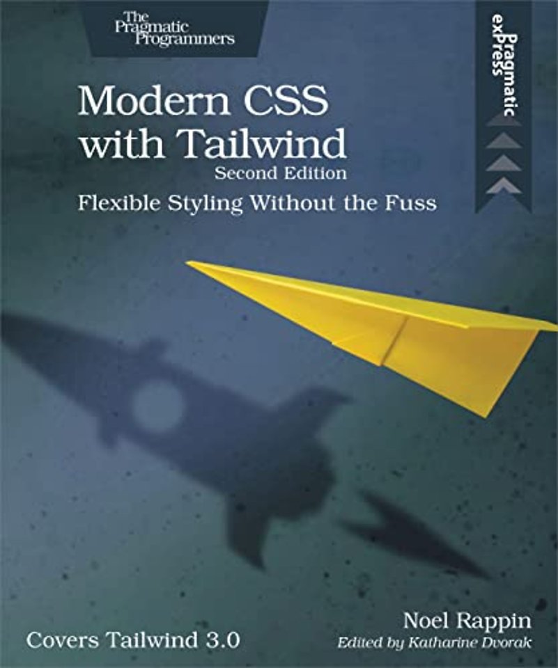
Flexible Styling without the Fuss (Covers Tailwind 3.0)
Paperback Engels 2022 2e druk 9781680509403Samenvatting
Tailwind CSS is an exciting new CSS framework that allows you to design your site by composing simple utility classes to create complex effects. With Tailwind, you can style your text, move your items on the page, design complex page layouts, and adapt your design for devices from a phone to a wide-screen monitor. With this book, you’ll learn how to use the Tailwind for its flexibility and its consistency, from the smallest detail of your typography to the entire design of your site.
This new edition of the book covers Tailwind 3.0, which changes the way Tailwind generates its CSS. Tailwind 3.0 has a large number of new features powered by the new system, including the ability to use arbitrary values with most Tailwind class patterns, and a new syntax for combining color and opacity in a single class. This book also covers the new standalone command-line tools for Tailwind.
With CSS, you can do amazing things to the basic text and images on your website, and with just a little bit of client-side code to add and remove CSS classes, you can do exponentially more.
In the latest edition of this book, you’ll learn how to use Tailwind 3.0 and the new way it generates CSS. You’ll code your way through Tailwind’s newest features, including the ability to use arbitrary values with most Tailwind class patterns and a new syntax for combining color and opacity in a single class. You’ll even dive into the new standalone command-line tools for Tailwind.
The Tailwind setup is extremely explicit and makes it possible to understand the display just by looking at the HTML markup. Start by designing the typographic details of the individual elements, then placing and manipulating those elements in “the box” using a flexbox or grid design. Finally, move those elements around the page with helpful small animations and transitions.
With Tailwind, it’s easy to prototype, iterate, and customize your display, use prefixes to specify behavior, change defaults, add new behavior, and integrate with legacy CSS.
Use Tailwind to make extraordinary web designs without extraordinary effort.
Specificaties
Lezersrecensies
Inhoudsopgave
Introduction
Why Tailwind?
About This Book
Who This Book Is For
Running the Sample App
Getting Started with Tailwind
What the Tailwind CLI Does
Using the Sample Code
Adding Tailwind to Your App
Quick Start
Tailwind Basics
Utilities
Preflight
Duplication
Modifiers
CSS Units
Typography excerpt
Size and Shape
Color and Opacity
Alignment and Spacing
Special Text
Lists
Typography Plugin
Tailwind Forms
The Box
Can You See the Box?
What’s in the Box?
Padding and Margins
Borders
Background Color
Background Images
Filters
Height and Width
Page Layout excerpt
Containers
Floats and Clears
Position and Z-Index
Tables
Grids
Columns
Flexbox
Box Alignment
Animation
Helpful Small Animations
Transitions
Transformation
Other Appearance Things
Responsive Design
Tailwind Screen Widths and Breakpoints
Hide Based on Size
Fewer Grid Columns on Small Devices
Flex on Larger Devices
Customizing Tailwind
Configuration File Basics
Change Default Values
Change Generated Classes
Variant Modifiers
Integrate with Existing CSS
Access Tailwind from JavaScript
Plugins
The End
Anderen die dit boek kochten, kochten ook
Rubrieken
- advisering
- algemeen management
- coaching en trainen
- communicatie en media
- economie
- financieel management
- inkoop en logistiek
- internet en social media
- it-management / ict
- juridisch
- leiderschap
- marketing
- mens en maatschappij
- non-profit
- ondernemen
- organisatiekunde
- personal finance
- personeelsmanagement
- persoonlijke effectiviteit
- projectmanagement
- psychologie
- reclame en verkoop
- strategisch management
- verandermanagement
- werk en loopbaan


